Appendix E: Integrated Equity Data for Sectors, Industries, Countries and Factors
By Jesse Livermore+
July 2019
In this Appendix, I’m going present and discuss integrated equity data for sectors, industries, countries and factors. In addition to showcasing the method and satisfying our curiosities, the data can help us pin down the ultimate causes of the profitability gap.
Data for U.S. Equities by Size and Period
We begin with data on U.S. equities by size and period1:
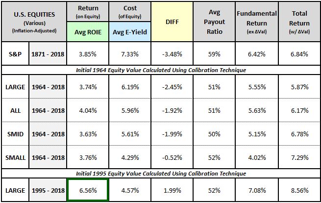
As you can see in the last row, large caps have enjoyed very strong ROIEs over the last two decades, with the profitability gap, shown in the “DIFF” column, reversing into a surplus—a condition in which the return on equity exceeds the cost of equity. This strength, however, is not the result of an actual increase in the corporate sector’s gross output. Rather, it’s the result of an increase in the corporate sector’s profit margin2, the share of its gross output that it has been able to claim for itself, at the expense of other stakeholders. The normalized chart below confirms that the strong earnings growth observed over the period has not been matched in sales growth:
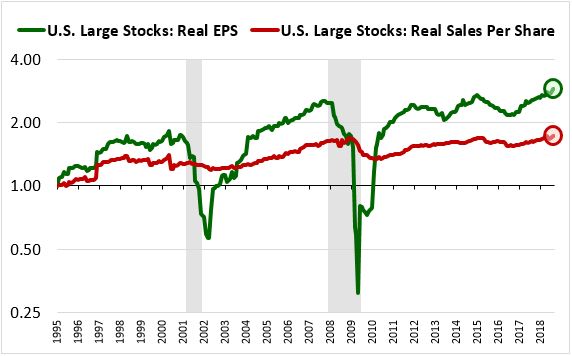
We can use the payout ratio method to estimate the contribution that the profit margin increase has made to the ROIE increase. From 1995 through 2018, the rolling average real sales per share growth of the U.S. Large Stock universe was approximately 1.67% per year. Dividing that number by the 48% of EPS that was deployed into investment, we get 3.49% real sales per share growth per unit of invested EPS, significantly below the 6.56% calculated ROIE. The profit margin increase has therefore been a key contributor to the observed ROIE increase. If it had not occurred, i.e., if profit margins had stayed constant, the implied return on equity (3.49%) would have been lower than the average earnings yield (4.57%), consistent with the pattern seen across the rest of market history.
The question is, when measuring investment profitability for the period, should we give corporations credit for the effects of the profit margin increase? One could answer yes on the grounds that the increase resulted from cost-cutting investments and is a relevant component of the return on those investments. The associated EPS growth is a causal consequence of the profitable substitution of capital for labor and should therefore be included when measuring the returns on that capital.
But one could also answer no on the grounds that the true driver of the profit margin increase over the period—changes in interest rates, industry dynamics, employee bargaining power, tax rates, regulatory enforcement, and so on—was not investment, but rather luck. Corporations happened to be in the right place at the right time, with strong secular tailwinds behind them. The strength that they experienced in the presence of those tailwinds is neither sustainable nor repeatable, and therefore they shouldn’t be given credit for it in the analysis.
Data for U.S. Sectors
To calculate returns on equity, the integrated equity methodology does not require access to reported book value data. We can therefore use it to generate data for U.S. sector indices organized by the Cowles commission, which go back to 1873. Results for the five major late 19th century sectors—industrials, railroads, utilities, coal and shipping—are shown below:
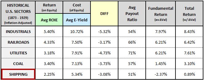
The results confirm that the profitability gap is a phenomenon that predates the modern era. In terms of the sectors themselves, the table tells us what we probably already knew: utilities, coal mining, and especially shipping are low-return businesses. The only way to make money in them over the long-term is to buy them on the cheap and hope that they pay out their cash flows.
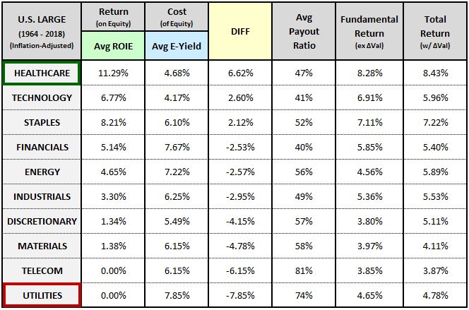
The table below shows data for modern U.S. GICS sectors sorted by their profitability gaps (least negative gap to most negative gap):
The table highlights the two different ways that companies can convert their earnings into returns for shareholders. First, they can allocate their earnings to investments that will lead to future growth. Second, they can use their earnings to pay dividends that will be reinvested and that will therefore compound at the rate of return embedded in their share prices.3
Companies with low levels of investment profitability can only deliver competitive returns to shareholders through the second option, the dividends option. To deliver those returns, they need to trade at attractive valuations. Given that the market demands a competitive return from them, it will drive them down to those valuations, if they aren’t already there. Their costs of equity will therefore tend to be significantly higher than their returns on equity, implying large profitability gaps.
To be clear, these gaps are not the source of the “inefficiency” in the inefficient investment hypothesis. Rather, the source of the inefficiency is the payout ratio. Companies with profitability gaps over a given period are paying out less than they should be paying out. To get to average returns on equity that are below their average costs of equity, they have to waste some portion of their earnings on suboptimal investments, a portion that would have been better allocated to dividends and share buybacks.4 From a shareholder perspective, the more they waste, the higher their earnings yields and profitability gaps have to get in order to make up for the losses and ensure a competitive return.
It’s neither a coincidence nor a mistake, then, that the sector with the lowest ROIEs in the table—Utilities—had the highest average earnings yield and the highest profitability gap. That result is to be expected, given the sector’s very low level of investment profitability.5 If there’s a mistake, it’s in the fact that even though the sector had a large profitability gap, it still deployed 26% of its earnings into investment. It could have delivered a much higher return to its shareholders—on the order of 8% per year—if it had instead recycled those earnings back into its cheap share price.6
Interestingly, the fact that Technology and Healthcare sit at the top of the list, with profitability surpluses, may be partly related to the fact that they are the two sectors that are most reliant on research and development. In 1973, FASB ruled that investments in research and development cannot be capitalized but must instead be immediately fully expensed in the period in which they occur. The immediate expensing of investments leads to understated earnings, which leads to higher ROIEs and lower average earnings yields.
Data for U.S. Industries
The table below separates the energy, materials and utilities sectors into underlying industries. To increase the number of companies, we’ve expanded the universe from U.S. Large Cap Stocks to All U.S. Stocks:
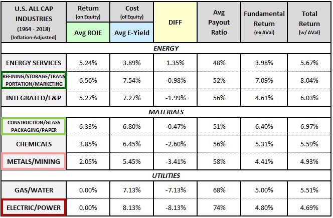
The refining and construction materials industries were the strongest performers in the group. They invested profitably and traded at attractive earnings yields—a combination that allowed them to deliver strong total returns. Electric power companies and metals and mining companies were the worst performers, exhibiting very low ROIEs that dragged down their total returns over the period. Note that the ROIEs for electric power companies were too low to calculate using the methodology, which is how the sector managed to generate a total return of only 4.69% despite paying out 74% of earnings at an average earnings yield of 8.13%.
The table below separates the industrial, consumer discretionary and financial sectors into underlying industries:
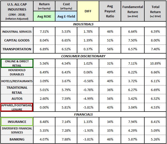
Measured on total return, the best-performing industry was online retail, boosted by a large weighting to Amazon. But this return was primarily attributable to an increase in valuation—the actual return from growth and dividends was significantly lower. The second best-performing industry was insurance, boosted by a large weighting to Berkshire Hathaway. The worst-performing industry was apparel, footwear and leisure. Its ROIE was too low to calculate using the methodology.
The table below separates the consumer staples, healthcare and technology sectors into underlying industries:
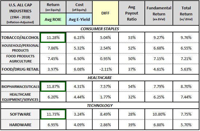
The three industries with the highest ROIEs of all industries examined were tobacco, biopharmaceuticals, and software. Those high ROIEs didn’t translate into commensurately high total returns, however, because the industries didn’t invest all of their earnings—they put a meaningful chunk into dividends, which were reinvested at relatively expensive prices. Software’s total returns were additionally depressed relative to its ROIE because it began the period trading expensively and experienced a significant subsequent decline in its valuation.
Data for Foreign Countries
The table below shows data for foreign countries:
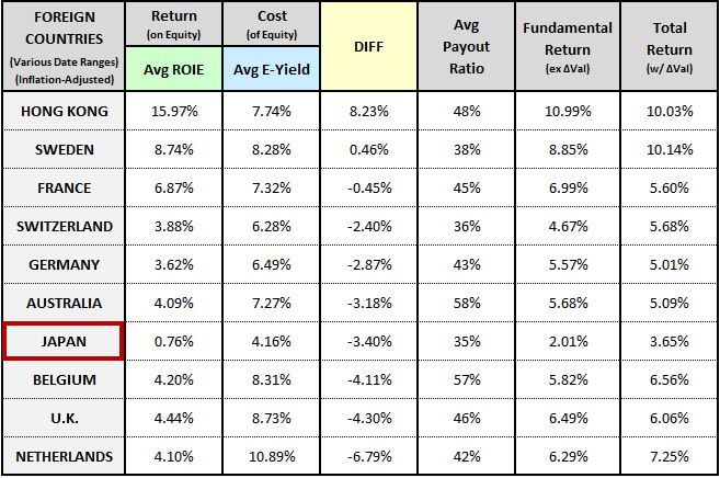
Japan had the lowest ROIE of all countries examined. But it also had the lowest average earnings yield, which means that it traded expensively. Because it traded expensively, with a low cost of equity, its profitability gap ended up being smaller than certain other countries, even though its profitability was worse. From a shareholder perspective, the fact that it traded with a low cost of equity is a bad thing—it’s the reason why the country produced the lowest overall total return.
Data for the Buyback Factor
Given the attention that share buybacks receive, we’re curious to see what the integrated equity methodology might calculate for the buyback factor. Unfortunately, we can’t run the methodology on the buyback factor because it frequently turns over its holdings. As Chris Meredith, Patrick O’Shaughnessy and I explained in Factors from Scratch, turnover creates its own type of earnings growth—what we referred in the piece as “rebalancing” growth. When calculating ROIEs under the methodology, we have no easy way to separate rebalancing growth from the “holding” growth that the underlying companies are generating through their investments, which is the growth that we’re interested in.
It turns out that we can still generate interesting buyback-related insights from the methodology. We just have to apply it to a turnover-free proxy for the buyback factor, rather than the buyback factor itself. We start by identifying current companies that have traded publicly for some continuous period of time—in this case, the last 20 years. For each of these companies, we calculate its buyback to retained earnings (BBRE) ratio, defined as the cumulative percentage of its retained earnings that it deployed into share buybacks over the full 20-year period. After calculating the BBRE for each company, we run the methodology on the top and bottom quintiles, which are static entities. We obtain the following results:
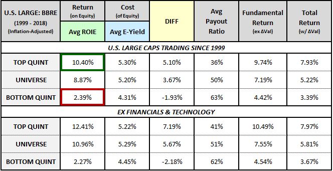
As you can see, companies that ranked higher on BBRE—i.e., companies that devoted larger shares of their total retained earnings to buybacks over the full period—enjoyed much higher levels of investment profitability and generated much higher total returns. Of course, this doesn’t prove any kind of causation or establish any kind of predictive association—a high BBRE could just as easily be a lagging effect of strong capital allocation and strong total returns as a leading predictor of them. But the relationship is interesting in light of separate evidence that companies that buy back large quantities of their shares tend to outperform in subsequent periods.
The chart below shows the trajectory of the top BBRE quintile’s accumulation of excess returns alongside its accumulation of excess buybacks relative to the bottom BBRE quintile:
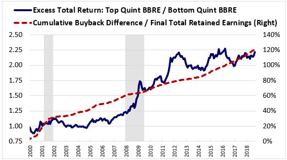
As you can see, the accumulation of excess buybacks relative to retained earnings doesn’t happen at the end of the process, after the outperformance has occurred. Instead, it occurs coincidentally—and, in some periods, in advance.
Conclusions from the Data: Inefficient Investment and Overstated Earnings
The tables above show that the profitability gap varies dramatically across different sectors, industries, and countries. In sectors, we saw large profitability surpluses in healthcare, technology and staples and large profitability gaps in utilities and telecom. In industries, we saw large profitability surpluses in tobacco, software, and pharma and large profitability gaps in apparel, autos, metals and mining and electric power generation. In countries, we saw large profitability surpluses in Hong Kong and large profitability gaps in Japan, Belgium, the U.K. and the Netherlands. This variance bolsters the case for the inefficient investment hypothesis because it’s easier to explain under that hypothesis.
To explain the variance under the inefficient investment hypothesis, all we have to do is acknowledge that companies in different sectors, industries and countries have historically experienced different levels of investment profitability. The companies that went on to experience low levels of investment profitability weren’t necessarily aware that this was going to happen in foresight, and so their capital allocation decisions ended up being inefficient in hindsight.
Explaining the variance under the overstated earnings hypothesis is more difficult. We have to posit that the sectors, industries and countries with profitability gaps overstated their earnings to a greater degree than the sectors, industries and countries with profitability surpluses. But do we have any reason to think that’s the case? Do we have any reason to believe, for example, that companies in the consumer discretionary sector would have been more inclined to overstate their earnings than companies in the consumer staples sector? Or that companies in the apparel sector would have been more inclined to overstate their earnings than pharmaceutical companies? Or that companies in Hong Kong would have been more inclined to overstate their earnings than companies in the United Kingdom, which uses a similar accounting standard? Probably not, which makes the overstated earnings hypothesis harder to defend.
Of course, an advocate of the overstated earnings hypothesis can respond by pointing out that there’s a crucial difference between seeing a profitability gap in a small partition of the economy and seeing a profitability gap across the entire economy. It’s expected that companies concentrated in certain parts of the economy—certain sectors, industries and even geographical regions—will have invested unprofitably in hindsight. Those companies will obviously deserve to trade at discounts to their equity values, with associated profitability gaps. Their equity, after all, is impaired, it doesn’t generate the market rate of return. But a situation in which companies trade at large average discounts to par, with large average profitability gaps, across the entire economy, for more than a century, is a very different situation. It implies an apparent level of inefficiency that’s better explained in terms of inaccuracies in the accounting framework.
Whitepaper Links
Footnotes
1 For readers that would like to compare the integrity equity data to similar data produced by the payout ratio method, I share the results of both methods alongside each other in Appendix B.
2 The data for the 1964-2018 and 1995-2018 periods were computed using recalibrated initial 1964 and 1995 book value estimates, respectively. The purpose of this recalibration is to clear out the residual effects of low-return investments that occurred prior to the periods of interest, allowing the average numbers to more accurately reflect the profitability trends that occurred inside those periods.
3 Share buybacks produce the exact same pre-tax outcome for shareholders, but the process happens inside the company rather than outside.
4 This logic doesn't necessarily apply in reverse to high ROIE sectors. The fact that their average ROIEs are higher than their average earnings yields doesn't mean that their payout ratios should have been lower. They should invest until their incremental return on equity falls below their cost of equity. It's perfectly conceivable that their return on equity over a period could be layered, with high incremental returns on the upper-layer opportunities and lower incremental returns on the lower-layer opportunities. If they do the right thing and invest until they reach the layer at which the return equals the cost, they will end up with an average return that exceeds the cost—a surplus—even as they rightly pay out some of their earnings to their shareholders.
5 The average ROIE for the sector is listed at 0.00% because the ROIE numbers were too low to calculate—the sector's real earnings were in decline for almost the entire period.
6 This point assumes that because utility company earnings declined sharply in real terms over the period, utility company investments during the period actually produced a low or zero return. It's possible that those investments did produce a return, and that the return helped offset an even larger fundamental decline that was set to occur for unrelated reasons. But that larger fundamental decline would then have to be credited to the ROIEs of other historical investments that the sector made, investments that did not turn out to be as profitable over the long-term as was expected.