Appendix D: The Payout Ratio Method
By Jesse Livermore+
July 2019
In this appendix, I’m going to introduce the payout ratio method, a shorthand method for measuring both the return on equity and the cost of equity. The payout ratio method estimates what the growth return and the dividend return of a company or index would have been if the company or index had deployed 100% of its EPS into each type of return, respectively. At the end of the appendix, I’m going to share sector, industry, country and factor data generated using the payout ratio method, to allow for comparisons with the integrated equity method.
For proper context, recall that corporations can deliver fundamental returns to shareholders in one of two ways: (1) by generating growth in their per share fundamentals and (2) by paying out dividends that then get reinvested.
To calculate the return from growth, we simply annualize the rate of change of the fundamental that we’re focused on—in this case, earnings. Since 1871, S&P 500 earnings per share have increased at an average inflation-adjusted annual rate of 1.91%. That’s the index’s return from growth.
To calculate the return from dividends, we simply take the difference between the annualized total return (with dividends) and the annualized price return (without dividends). Since 1871, the annualized inflation-adjusted total return of the S&P 500 has been 6.84%. The annualized inflation-adjusted price return has been 2.32%. The return from dividends has therefore been 6.84% - 2.32% = 4.52%.
Now, the return from growth was generated by reinvesting a portion of earnings. The return from dividends was generated by paying out a portion of earnings. To implement the payout ratio method, we adjust each of these return sources to reflect what their return contributions would have been if 100% of earnings had been devoted to them. In this way, we put both sources on an equal comparative footing.
From 1871 to present, roughly 59% of S&P 500 EPS was paid out as dividends, producing a dividend return of 4.52% per year. It follows that if 100% of the index’s EPS had been paid out, the return would have been roughly equal to 4.52% / 59% = 7.65%. That number—7.65%—is the S&P 500’s full-EPS dividend return.
Over the same period, roughly 41% of S&P 500 EPS was retained and reinvested, yielding growth of 1.91% per year. It follows that if 100% of the index’s EPS had been reinvested at that rate, the return would have been roughly equal to 1.91% / 41% = 4.67%. That number—4.67%—is the S&P 500’s full-EPS growth return.
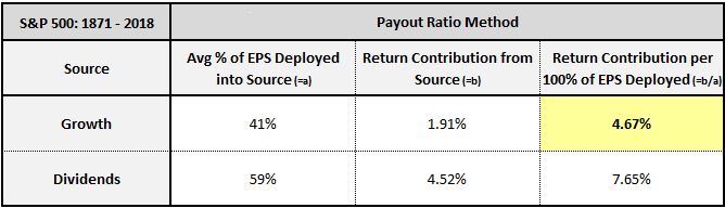
Ultimately, the 4.67% full-EPS growth return, highlighted in yellow, is a measure of the S&P 500’s return on equity—the thing that we’ve been attempting to measure this whole time. It’s the fundamental return that accrues to shareholders “per unit of earnings deployed into investment”, which is the same as “per unit of equity “ or “per unit of book value”, given that equity and book value are simply accumulations of earnings that get retained and reinvested over time.
Similarly, the 7.65% full-EPS dividend return is an approximation of what the index’s return would have been if all of its earnings had been used to pay out dividends (or buy back shares, had that been legal). It’s the return that’s embedded in the prices of the shares. We can therefore think of it as the index’s cost of equity.
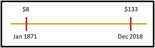
The advantage of the payout ratio method is that it’s quick and easy—we only need a few numbers to calculate it. The disadvantage is that its growth component is vulnerable to cyclical distortion. Calculating a growth rate requires comparing earnings at two different points in time—in the above case, S&P 500 earnings in January 1871 ($8 in real terms) and December 2018 ($133 in real terms). If the numbers on either of those dates turn out to be depressed or elevated relative to trend, then the associated distortions will show up in the calculated full-EPS growth return and therefore the estimated ROE.
To mitigate the risk of cyclical distortions in the ROE estimate, we can calculate the growth rate as a rolling average. In other words, instead of calculating a single growth rate from January 1871 through December 2018, we can calculate a growth rate from January 1871 to January 2003, then February 1871 to February 2003, then March 1871 to March 2003, and so on in, averaging all of the respective growth rates together. In the tables presented below, we use rolling periods sized to create 15 years of variation in the starting and ending values of the growth rate calculation—roughly two economic cycles. When the S&P 500’s rolling growth rates are averaged together in that way, the 4.67% number drops to 4.02%.
To further reduce the risk of cyclical distortion, we can use the method to calculate full-EPS sales growth in addition to full-EPS earnings growth. Sales growth is a more cyclically stable quantity than earnings growth. When there’s a large difference between the two types of growth, that’s often a sign that cyclical forces are at play.
The table below provides a template for how we’re going to display sector, industry, country and factor data in this appendix:
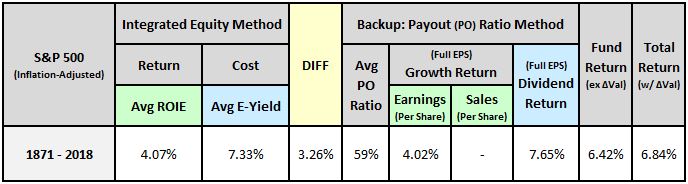
As an estimate of the return on equity, the earnings growth (per 100% of EPS deployed) backs up the average ROIE. In the case of the S&P 500, the two measures, shaded in light green, end up matching almost perfectly. In smaller indexes with shorter histories, they usually won’t match each other as closely. But they’ll be generally near each other, within a percentage point or two.
As an estimate of the cost of equity, the dividend return (per 100% of EPS deployed) backs up the average earnings yield. The two measures, shaded in light blue, are almost always very close to each other. That’s because (1) they measure the same thing—i.e., the cost of equity, and (2) the dividend calculation isn’t vulnerable to cyclical distortion in the same way that the growth calculation is.
At the far-right end of the table, there are two return measures. First, the “fundamental” return that the index delivered strictly from growth and dividends, and second, the actual total return. The difference between the two returns is the index’s annualized change in valuation over the period.
The difference between the return on equity and the cost of equity is highlighted in yellow. A negative difference implies a profitability gap—a condition in which the return on equity is insufficient to justify the cost of equity.
What follows is a reproduction of the data shown in the main piece, but with results for the payout ratio method shown alongside results for the integrated equity method.
Data for U.S. Equities by Size and Period
We begin with data on U.S. equities by size and period:
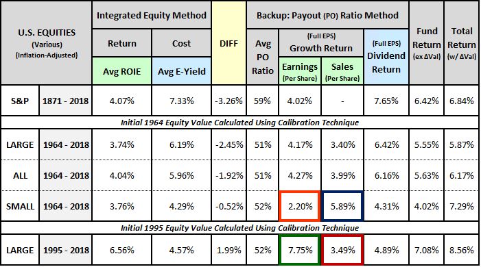
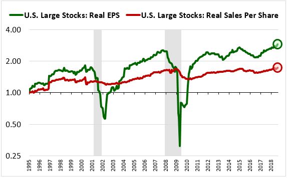
The OSAM U.S. equity indices come with sales data, so we can use them to track the effects of profit margin changes. As you can see in the last row, large cap ROIEs and full-EPS growth rates over the last two decades have been very strong, with the profitability gap, shown in the “DIFF” column, reversing into a surplus. That strength, however, is primarily attributable to a large increase in profit margins. As the chart below confirms, the strong earnings growth (boxed in green) has not been matched in sales growth (boxed in red):
Earnings for the small cap universe are currently in a downturn. This downturn is depressing the calculated full-EPS earnings growth return (boxed in orange) relative to the full-EPS sales growth return (boxed in blue) in the table. It’s also depressing the fundamental return, which is partly calculated from earnings growth:
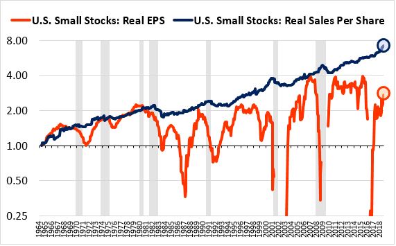
Readers should not put too much stock in the small cap results because small cap earnings tend to be erratic and unreliable. That’s why, in the table of factor performance shown in the main piece, the P/E ratio was not as effective as a factor in small and mid caps as it was in large caps.
Data for U.S. Sectors and Industries
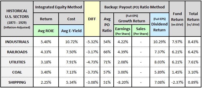
The table below shows Cowles sector results for industrials, railroads, utilities, coal and shipping from 1873 to 1929:
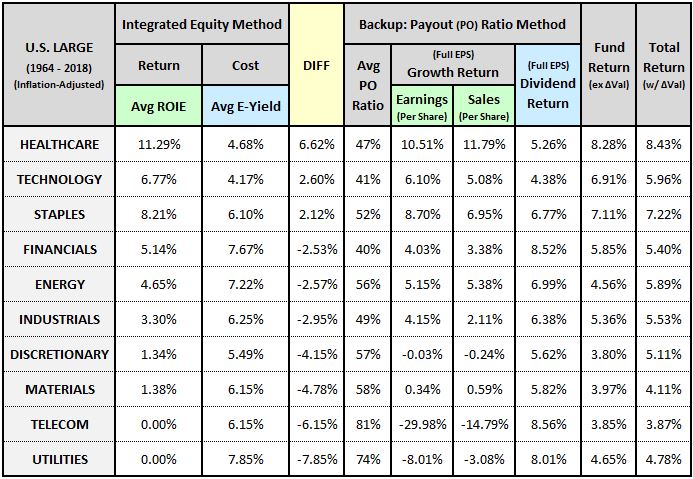
The table below shows results for modern U.S. GICS sectors from 1964 to 2018:
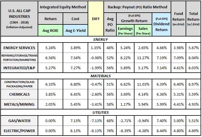
The table below separates the energy, materials and utilities sectors into underlying industries. To increase the number of companies, we’ve expanded the universe from U.S. Large Cap stocks to All U.S. Stocks:
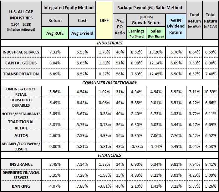
The table below separates the industrial, consumer discretionary and financial sectors into underlying industries:
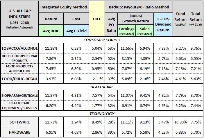
The table below separates the consumer staples, healthcare and technology sectors into underlying industries:
Data for Foreign Countries
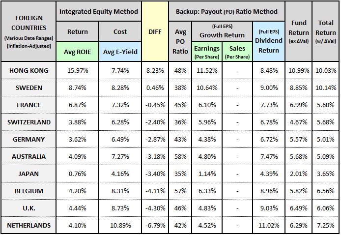
The table below shows data for foreign countries over various date ranges:
Data for the Buyback Factor
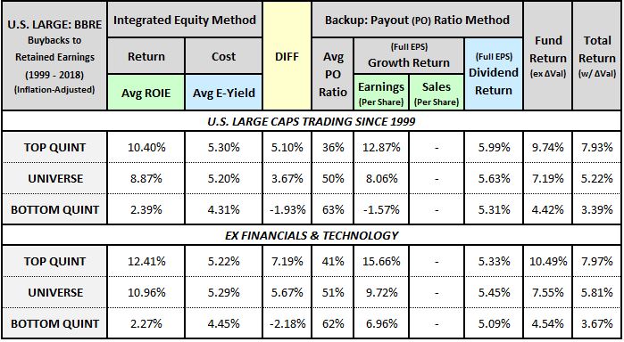
The table below shows data for the cumulative buyback-to-retained-earnings factor from 1999 to 2018:
Whitepaper Links